Identity redesign
SafSec - a company specialized in performing risk inventory & evaluation, security risk assessment and guaranteeing safety with attention to continuity asked me for an update and redesign to take care of their corporate identity and provided appropriate material.
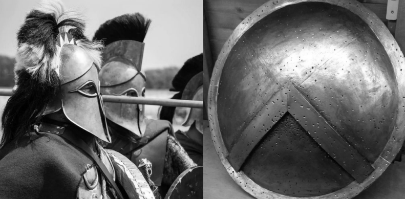
The goal for this redesign is to visualize the duality that already exists within the company name: Safety and Security, without losing the link to the old identity. Recognizable as being an upgraded and more modern version, showing existing clients as well as potential ones that SafSec is a firm that evolves and grows with the changing times. To depict this duality and still retain the visual recognizability, the Corinthian helmet and hoplon shield where chosen as symbols to communicate Safety and Security. The helmet, and the hoplites that wore it translate to proactivity, vigilance and security. The shield, Safety and resilience.
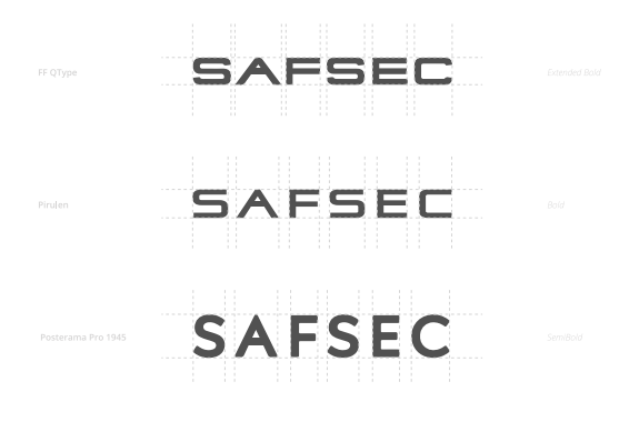
Many fonts were tested to try and match the company's values. I found in the end the Pirulen font to be an exceptional match. A small adjustment to the letter A allowed me to incorporate the Phalanx symbol from the hoplon shield into the visual design.

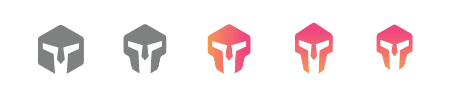
The brand icon went through multiple iterations as well. Starting with the concept and ending with a highly detailed, strong and recognizable image.
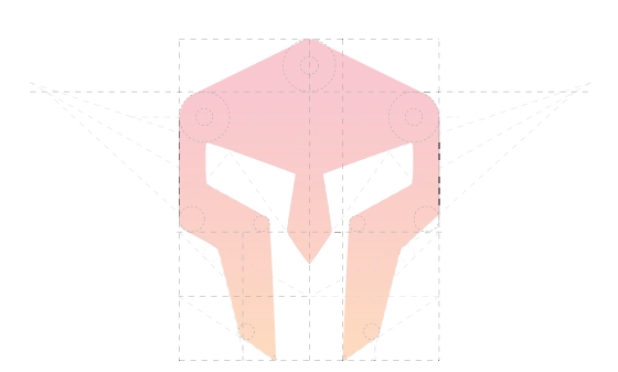

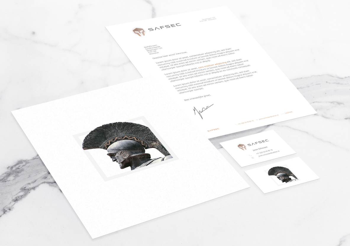
After the final color changes, to fit the clients preferences, we're left with a very sharp, modern and storytelling corporate identity.